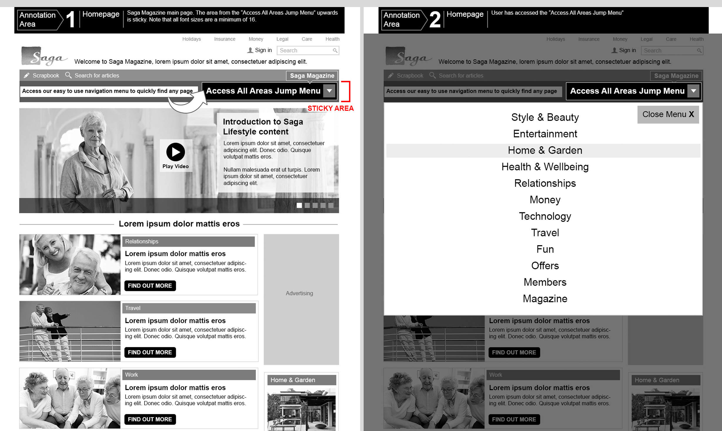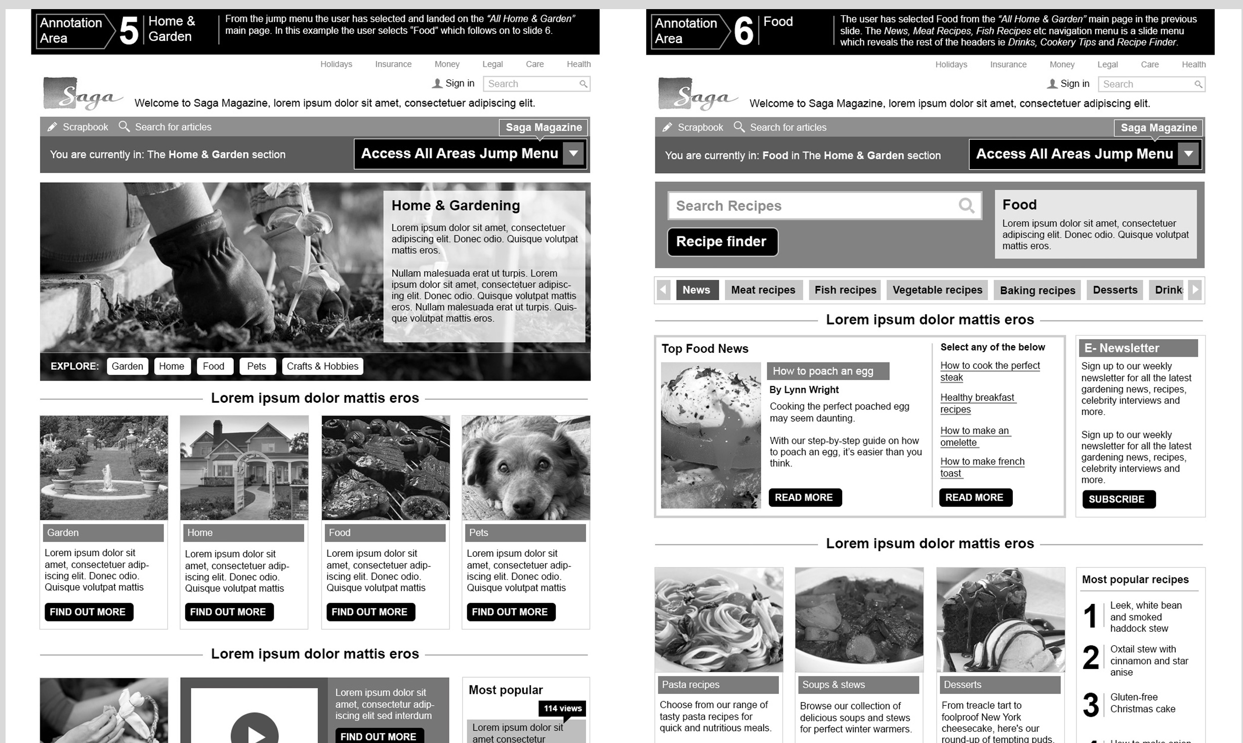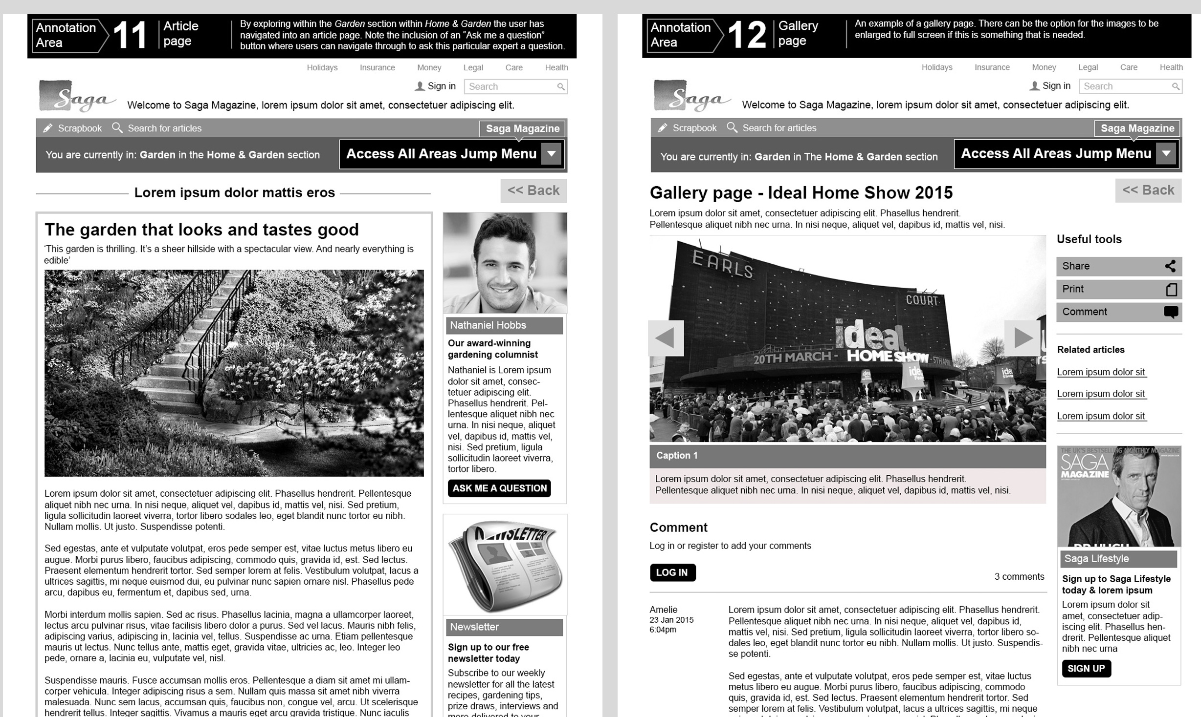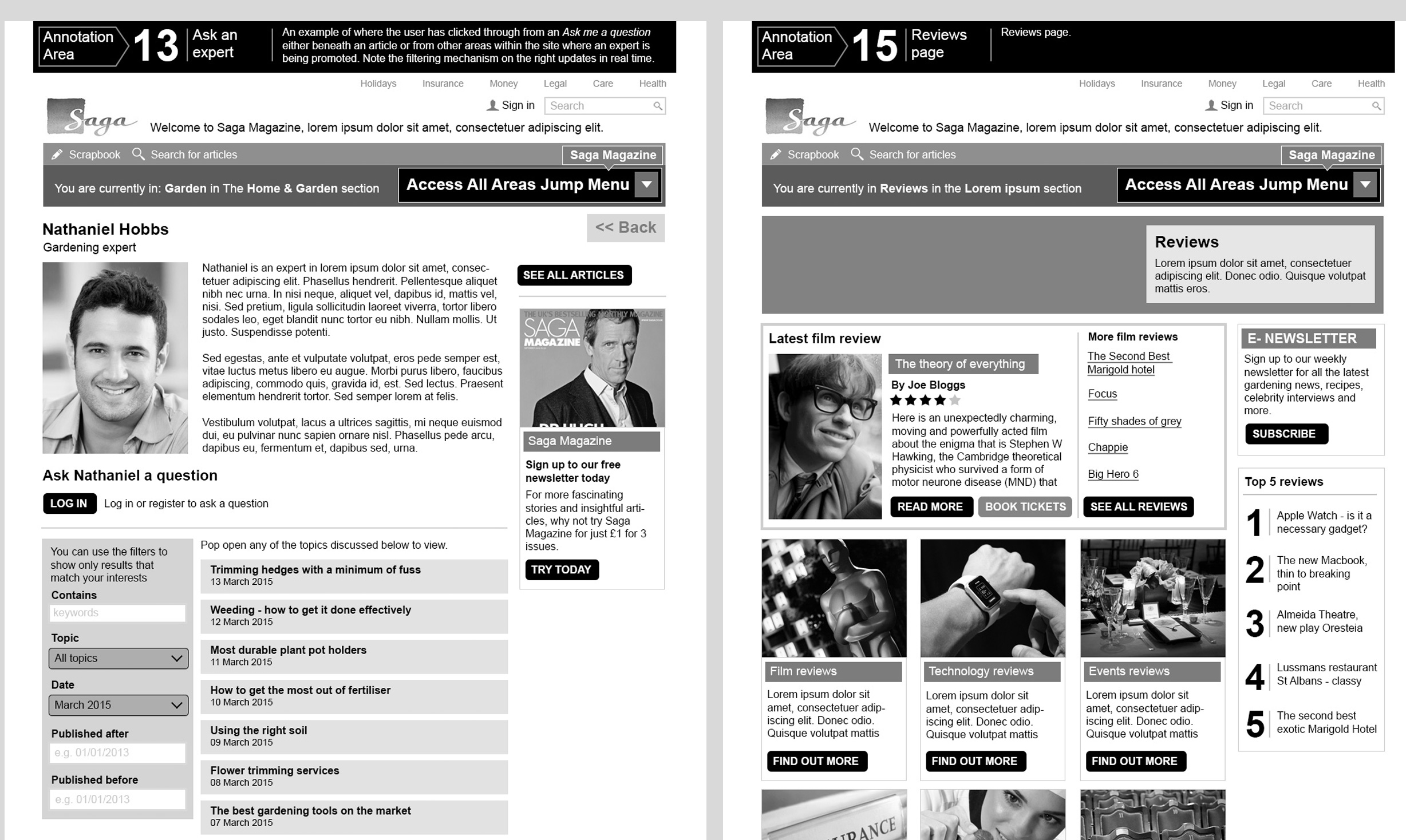
Solving the UX for the magazine area of the Saga website.
Improving the usability of the high traffic area that is Saga Magazine.
The brief was to improve all aspects of the Saga Magazine area of the Saga brand. This included multiple workshops, information architecture restructuring, and synthesis of extensive discovery.

Context & research
A large aspect of the research was looking at lifestyle brands where the confirmed personas for this audience were associated. We looked at the pains and gains for this audience, and how they expected to interact in this space.

Ideation
Templates were defined by means of synthesising the extensive discovery to date. Differentiating between article pages, content heavy pages, and navigational pages was the order of the day, using a paddle, swim and dive motif.

Ideation
At launch we had a greatly improved product where the user was able to utilise the Magazine area of the site with the same dexterity as they would their favourite printed magazine, with bold, engaging navigational elements that was intuitive and logical.
