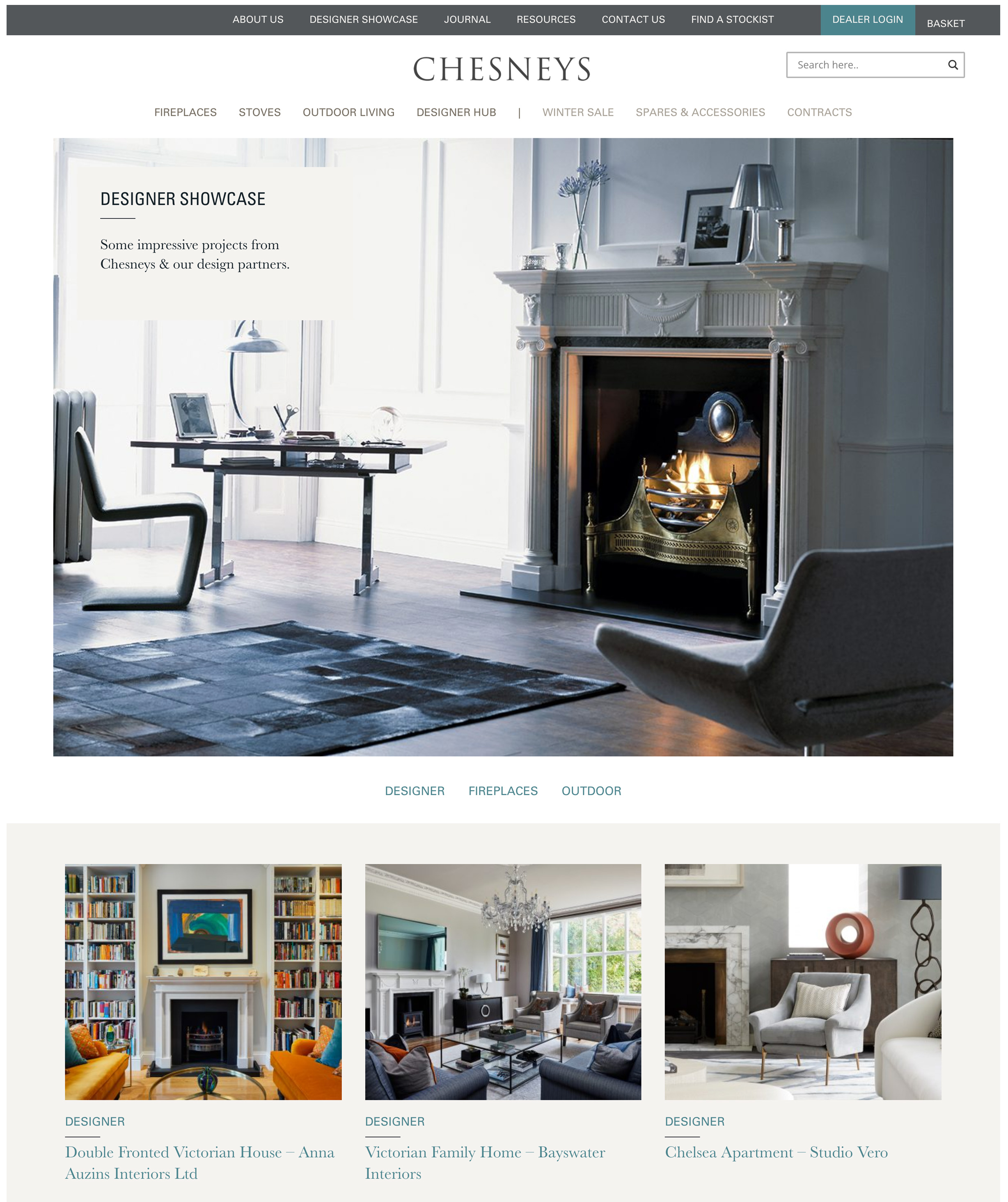
Recreating a website for the luxury interior design brand Chesneys
Rebuilding a large luxury brand ecommerce site from the ground up
The Chesneys site had become bloated and disorganised after years of stapling on content as the business expanded, so the first port of call was a detailed analysis of the sitemap and content, with some well structured workshops with senior stakeholders. The brief was a fundamental redesign of the brand and the site, which is always an exciting proposition.
Explore Chesneys
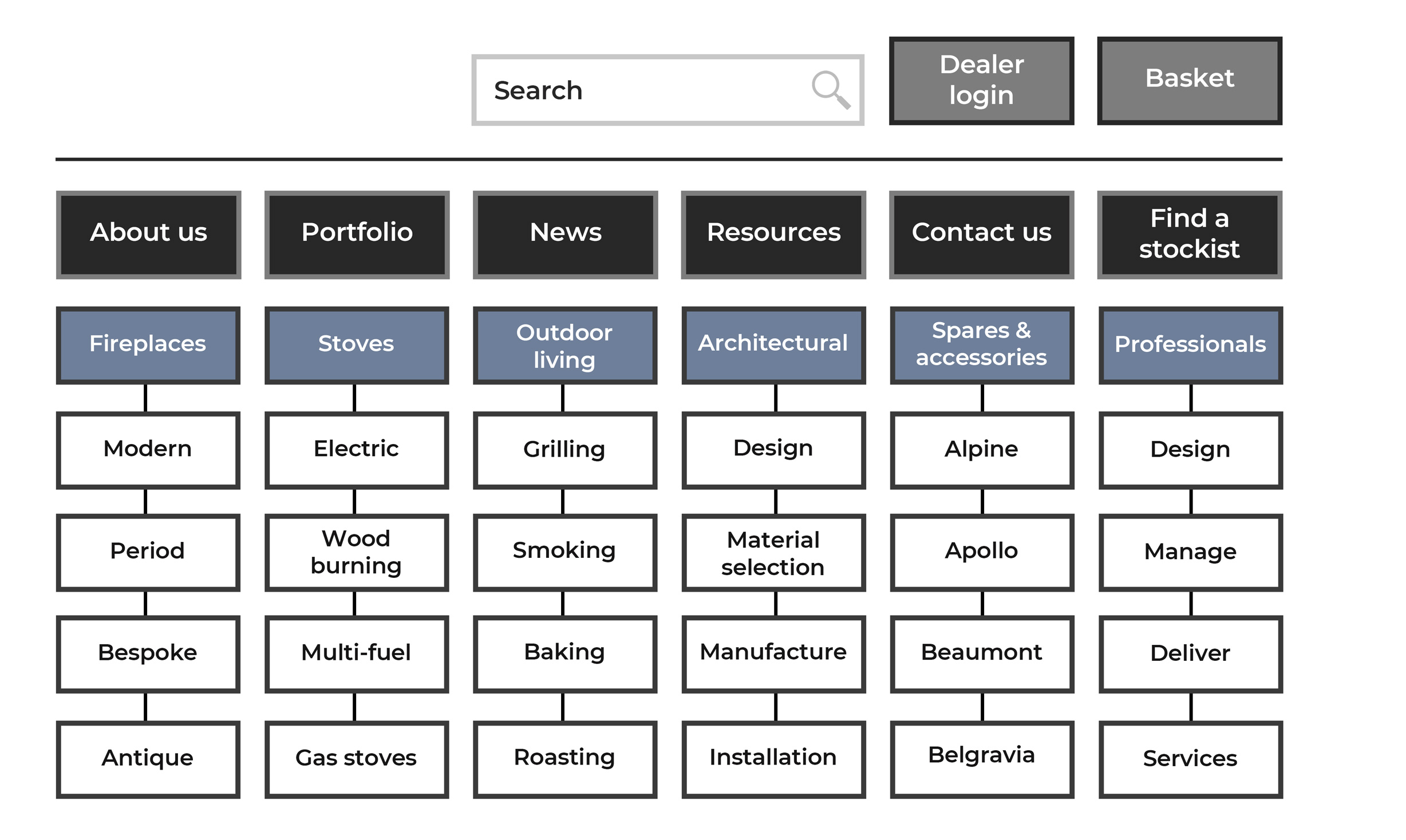
Tree testing & sitemap reassembly
After an intensive 2 hour workshop where key questions were answered including where legacy content exists, and what needs to be prioritised in line with business requirements, the sitemap was reassembled and tree tested alongside the existing version. With hypotheses validated in this regard a new sitemap was proposed and signed off.
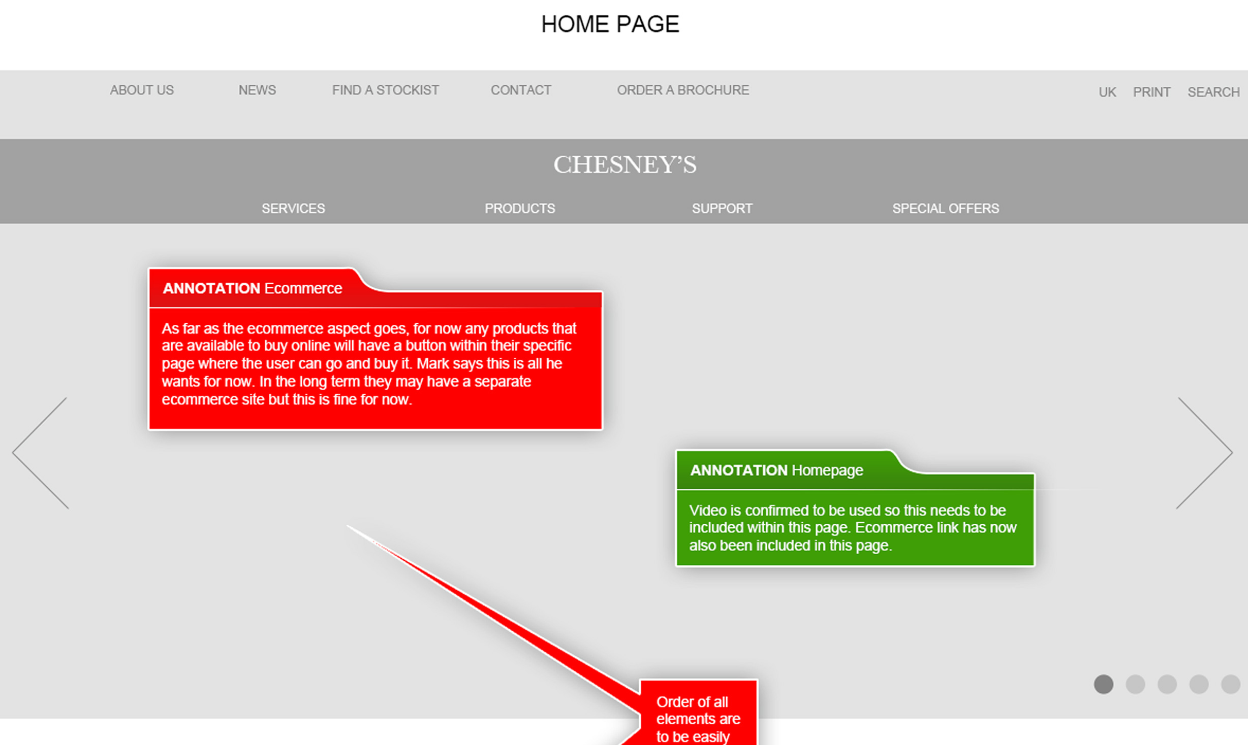
Ideation & design sprint
Following a design sprint where initial scamps were spread across the walls of a boardroom and annotated with key questions answered by stakeholders, comprehensive wireframing began for prototyping. The merging of pages, clarification on redundant content and established personas informed the key user journeys and higher fidelity wireframes to be created.
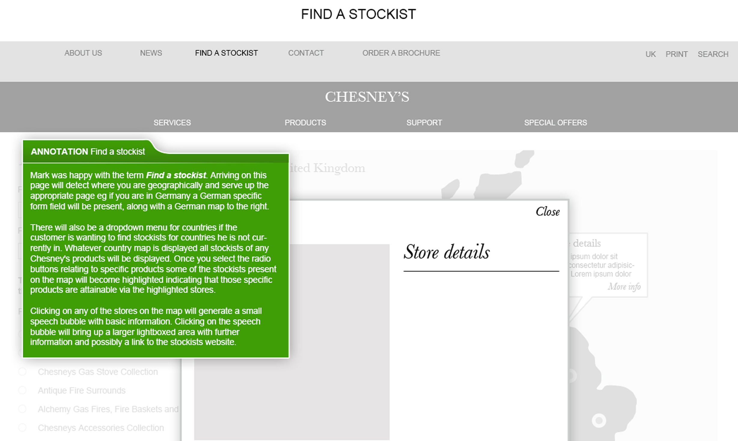
High fidelity prototypes in Axure
With discovery complete high fidelity prototypes were created in Axure, and ued in testing. After findings synthesis was produced and presented, the new components creation were officially in motion.
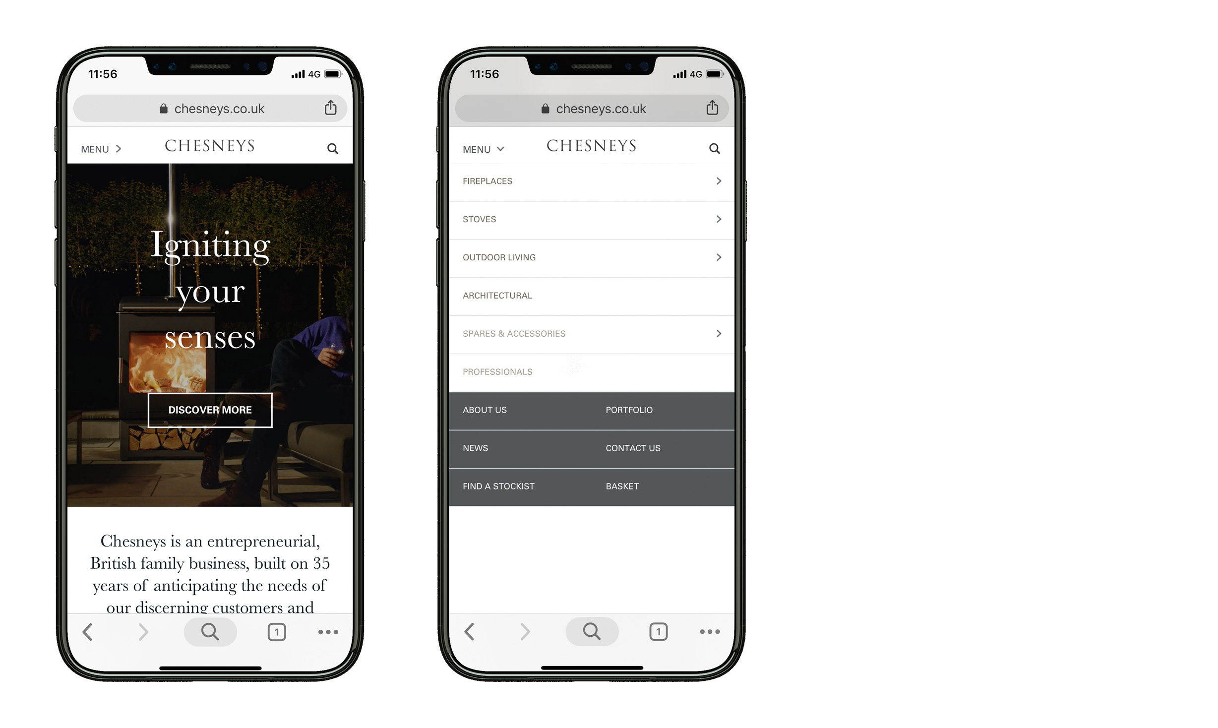
From scratch to complete
Since no components existed in a design system it was a matter of starting from scratch. All existing live components were reimagined in line with the new brand, site structure and established content zoning. The end result - a brand new data driven website, restructured, with new established components, a publishing framework, a new back end system and brand guidelines.
