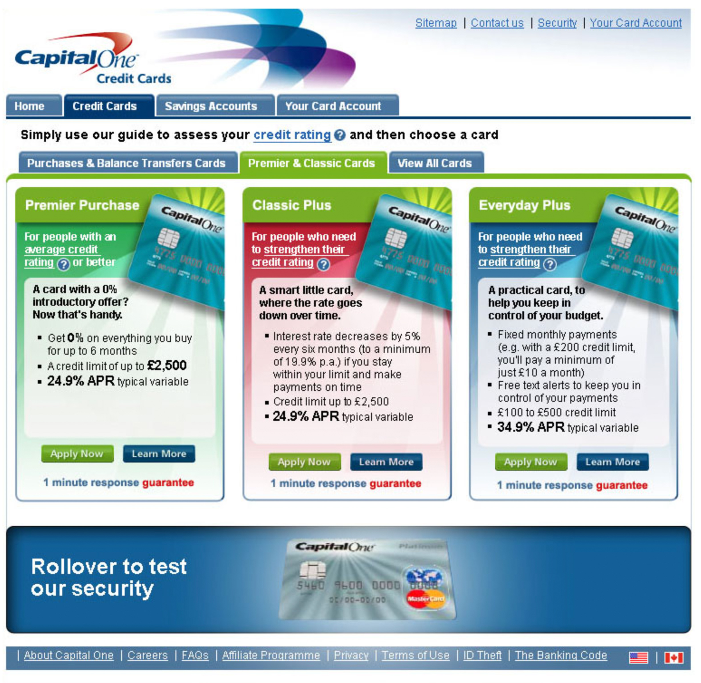
Work done for Capital one advertising their new range of credit cards.
Overview
Designs created for new cards for Capital One
The incentive was to boost the staid image Capital One had previously, and ensure the financial products were communicated effectively.

Overview
A new design language to boost conversions
Clarity was needed to reduce the cluttered information in the legacy designs, with an emphasis on getting prospects and customers to checkout and journey end respectively.
